Accessing Fire Indicators
Mapping Drought Indices
In this section, we will go step by step through how to create maps of drought indices. These are useful for understanding conditions pre-fire. To tie this to a real work example, we will map drought layers prior to the 2007 Angora Fire. We will see that most of the area inside of the fire perimeter was in severe drought prior to the fire start date.
Step 1: Open the Climate Engine App
To open the Climate Engine app, in your browser head to app.climateengine.org. If this is your first time using the app, you will be prompted to create a free account (find directions here). To make a map, ensure you are on the Make Map tab of the panel on the left hand side of the app.
Step 2: Fill out the Variable section
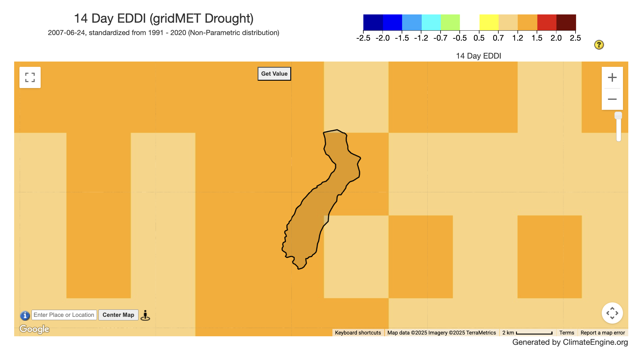
First, you need to select which type of data variable you are interested in. Since we are interested in historical drought, we will select the Climate & Hydrology type. Next, we will search for GridMET Drought - 4km - Pentad as the Dataset.
GridMET Drought has various drought variables at different temporal lengths - Standardized Precipitation Index (SPI) 14-day, 30-day, 60-day, 90-day,180-day, 1yr, 2yr, 5yr; Standardized Precipitation Evapotranspiration Index (SPEI) 4-day, 30-day, 60-day, 90-day,180-day, 1yr, 2yr, 5yr; Evaporative Demand Drought Index (EDDI) 4-day, 30-day, 60-day, 90-day,180-day, 1yr, 2yr, 5yr; Short and Long Term Drought Blends, Palmer Drought Severity Index (PDSI), and Palmer Z-Index (Z).
Once we selected the dataset, the variables for that dataset will populate the Variable drop-down. We will select a 14 Day EDDI, which has been identified as valuable for understanding fire risk in the western US (McEvoy et al., 2019).
Step 3: Fill out the Processing section
Since we selected a Standard Index variable, there will be only one option for Statistic (over day range), we will leave it at No Statistic. For the Calculation we will leave it at Standard Index.
Step 4: Fill out the Time Period section
Since we selected a pre-calculated standard index, all we need to do is update the End Date value. The fire started on June 24, 2007 so we will use that as our end date to visualize the conditions right before the fire (2007-06-24). Then we will click the Get Map Layer button to visualize the results on the mapping panel on the right of the app.
Optional Step: Add Fire Perimeter Overlay
On the right side of the App, above the map, you will see different drop-downs that allow you to interact with the map. We will expand the Layers drop-down and scroll to the US Fire Perimeters Layers section. We will then check on the 2007 layer and zoom to just below Lake Tahoe.
Interested in a similar workflow using the Climate Engine API?
The Climate Engine API allows users to extend their analysis by exporting larger geotiffs, creating timeseries data over multiple areas, and writing loops to make multiple API calls. You can find a python notebook walking you through a similar workflow here.
Mapping Fire Indicators
In this section, we will go step by step through how to create maps of historical and forecasted fire indicators. These can help with the context of past fire events, and understanding conditions in the near-future. By combining these two datasets, we can also look how near-future values differ from past values.
Example # 1: Mapping Fire Indicators Prior to the Angora Fire
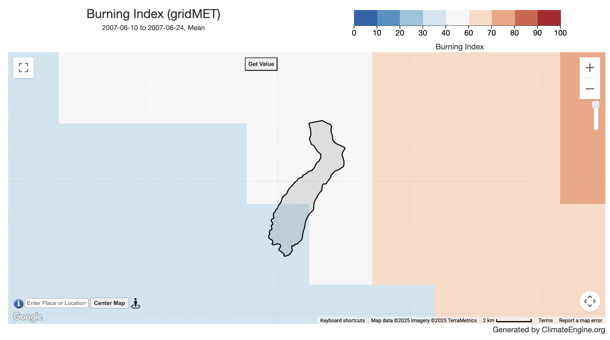
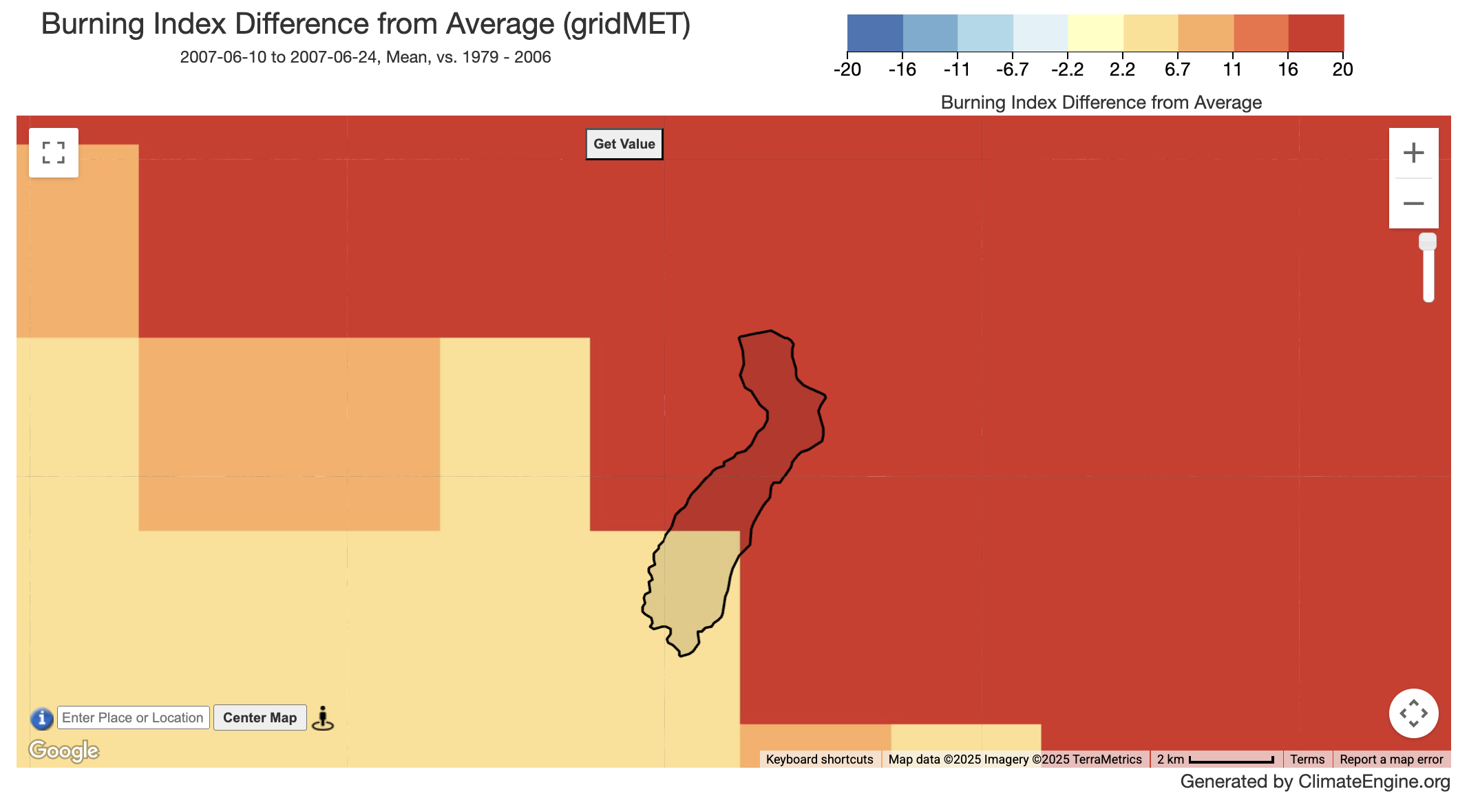
Similar to the workflow detailed for mapping drought indices, we will start with updating the Variable section. We will keep the Type as Climate & Hydrology and update Dataset to GridMET - 4km - Daily. Lastly, we will update the Variable to Burning Index. Moving to the Processing section, we will leave the Statistic (over day range) as Mean and Calculation as Values. Finally, within the Time Period section we will choose to use a Custom Date Range. The Start Date will be updated to 2007-05-10 to capture the mean values over the two-weeks prior to the Angora Fire. The End Date will be kept at 2007-06-24. Then we will click the Get Map Layer button. We see that part of the perimeter falls within the 30 - 40 value range which indicates moderate fire danger and the other part falls within the 40 to 60 range which indicates high fire danger (burning index categories).
We can further explore what these values mean by calculating anomalies, i.e. looking at them in context of past values. To do this, we can head back to the Processing section and change the calculation from Values to Difference From Average Conditions. This will update the options for the Time Period section, add a Year Range for Historical Avg/Distribution . We will choose to set the range to all of the years leading up to the fire, 1979 - 2006. Then we will click the Get Map Layer button. This will show the difference in Burning Index values from the average for 1979 - 2006. We see the values of difference range from +2.2 to > +20.
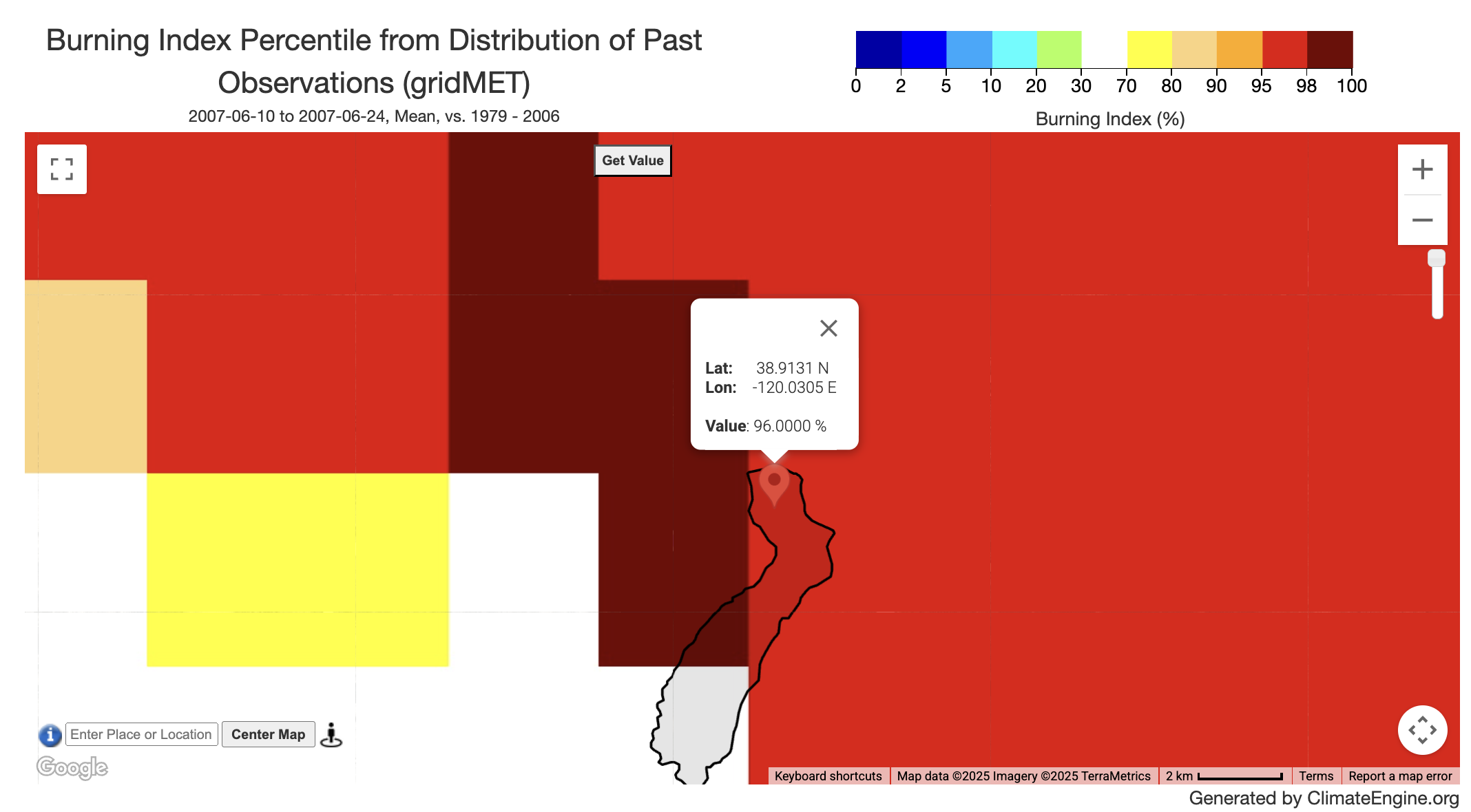
Another option for understanding how the time period right before the fire differed from previous years is map percentiles. To do this, all we update is the Calculation to Percentile in Distribution of Past Observations. Here we see the burning index values in the north section of the fire perimeter are in the 95th + percentile of all of the values between 1979 and 2006 for that time period.
This sequence of analyses can be completed for the Energy Release Component, 100-HR Dead Fuel Moisture (FM-100), and 100-HR Dead Fuel Moisture (FM-100) variables by only updating the Variable drop-down of the Variable section. If you've made multiple maps in this session, you can click Reset before going on to the next example. This helps ensure that none of the variables from the previous map get caught, and leave you with a map you didn't expect. It is helpful to do this after every 5 or so mapping requests.
Example #2: Mapping Forecasted Fire Indicators
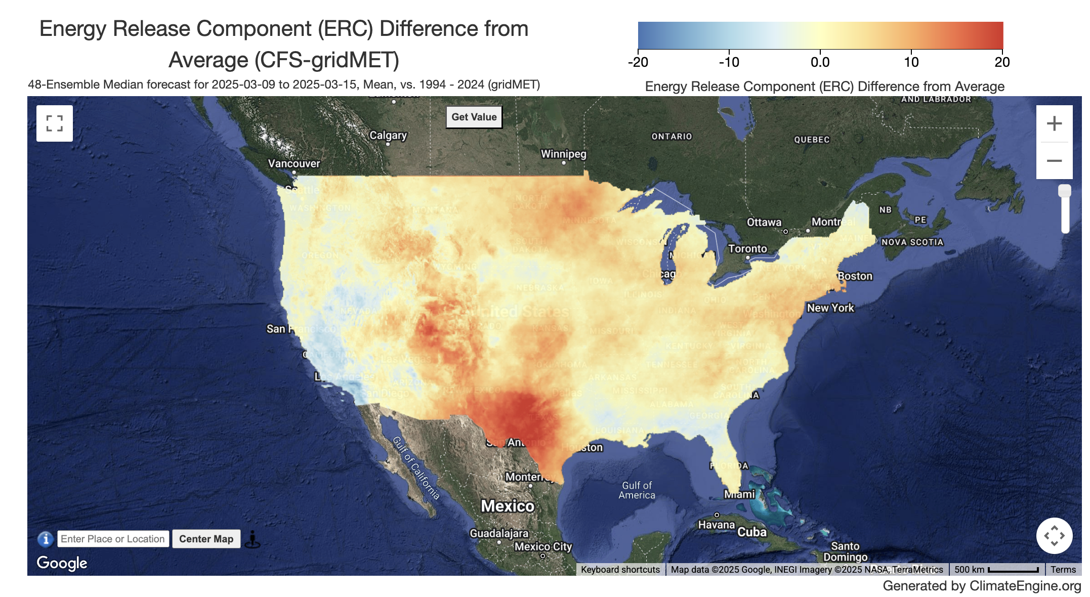
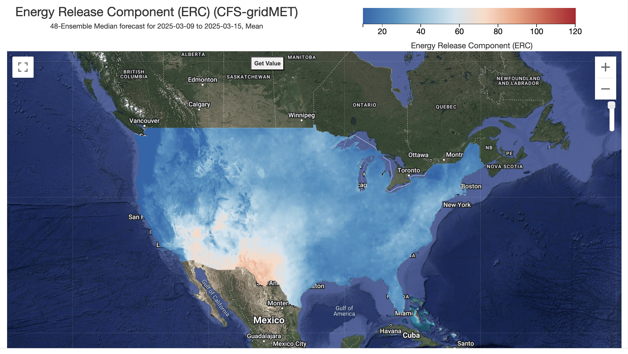
Similar to the workflow for mapping historical fire indicators, we will start in the Variable section. We will start by updating Type to Forecasts. This will load a new set of datasets into the Dataset drop-down. We are going to select CFS gridMET - 4km - 1to28day and the move to Variable where we are going to select Energy Release Component (ERC). In the Processing section, a new option called Statistic (over forecast ensemble). This allows you to select specific ensembles or Median/Mean/Minimum/Maximum/25th Percentile/75th Percentile of the 48 ensembles. We will leave all of the defaults for that section for now. Lastly, we will move to the Time Period section. The options for this section are a bit different for the forecasts. We provide various summarization options. We will choose Week 1 (Next 1-7 Days of Data).
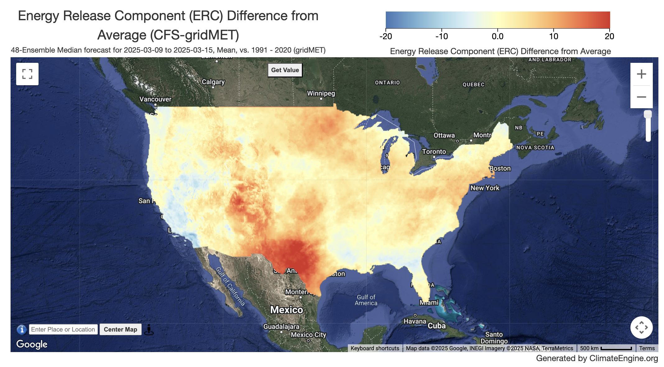
We can then evaluate the forecasted week of values vs a past time period to see how much those values differ. We will head back to the Calculation drop-down in the Processing section. We will update the Calculation to Difference from Average Conditions. We will then head to the Time Period section, where Year Range for Historical Avg/Distribution has been added. We will update the year range to 1991 - 2020. The CFS gridMET forecast values will be differenced from the gridMET values.
This sequence of analyses can be completed for other forecast variables as well.
Interested in a similar workflow using the Climate Engine API?
The Climate Engine API allows users to extend their analysis by exporting larger geotiffs, creating timeseries data over multiple areas, and writing loops to make multiple API calls. You can find a python notebook walking you through a similar workflow here.
Plotting Fire Indicators
In this section, we will shift gears and go step by step through how to charts of historical and forecasted fire indicators.
Example #1: Plotting Forecasted Fire Indicators
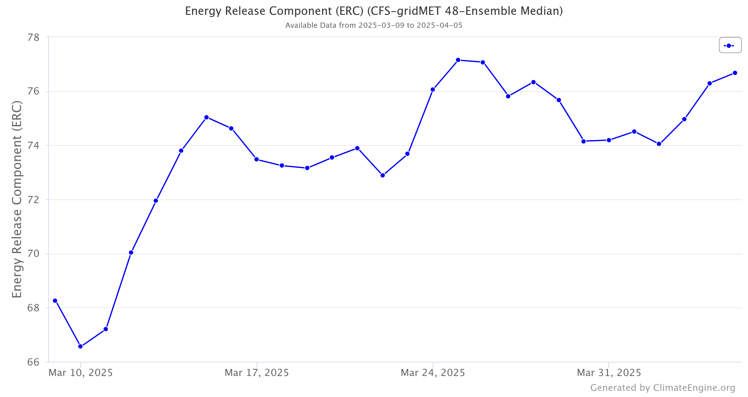
To start making a chart, ensure you are on the Make Graph tab of the panel on the left hand side of the app. We will start at the Time Series Calculation section. We will keep the first drop-down on Native Time Series and second drop-down on One Variable Analysis. Next, we will move to the Region section where we will select US Regions using the drop down. It will then add another drop-down where we will select US Hydrologic Unit Codes(HUC) 8. It will then populate the last drop-down with huc-8 options, and we will select Colorado Headwaters. Finally, we will move to Variable 1. If you just requested a map, the details will automatically populate this section. We will work our way through it. First, we will ensure that Type is Forecasts, Dataset is CFS gridMET - 4km - 1to28day, and Variable is Energy Release Component (ERC). Next, we will leave the Computation Resolution (Scale) at its default which is 4000m, Statistic (over region) on Mean, and Statistic (over forecast ensemble) at 48-Ensemble Median . Lastly, we will select Week 1-4 (Next 1-28 Days of Data) for Time Period. Then we will click the Get Map Layer button. Then we will click the Get Time Series button. To download the chart, hit the Download button on the top right corner of the chart.
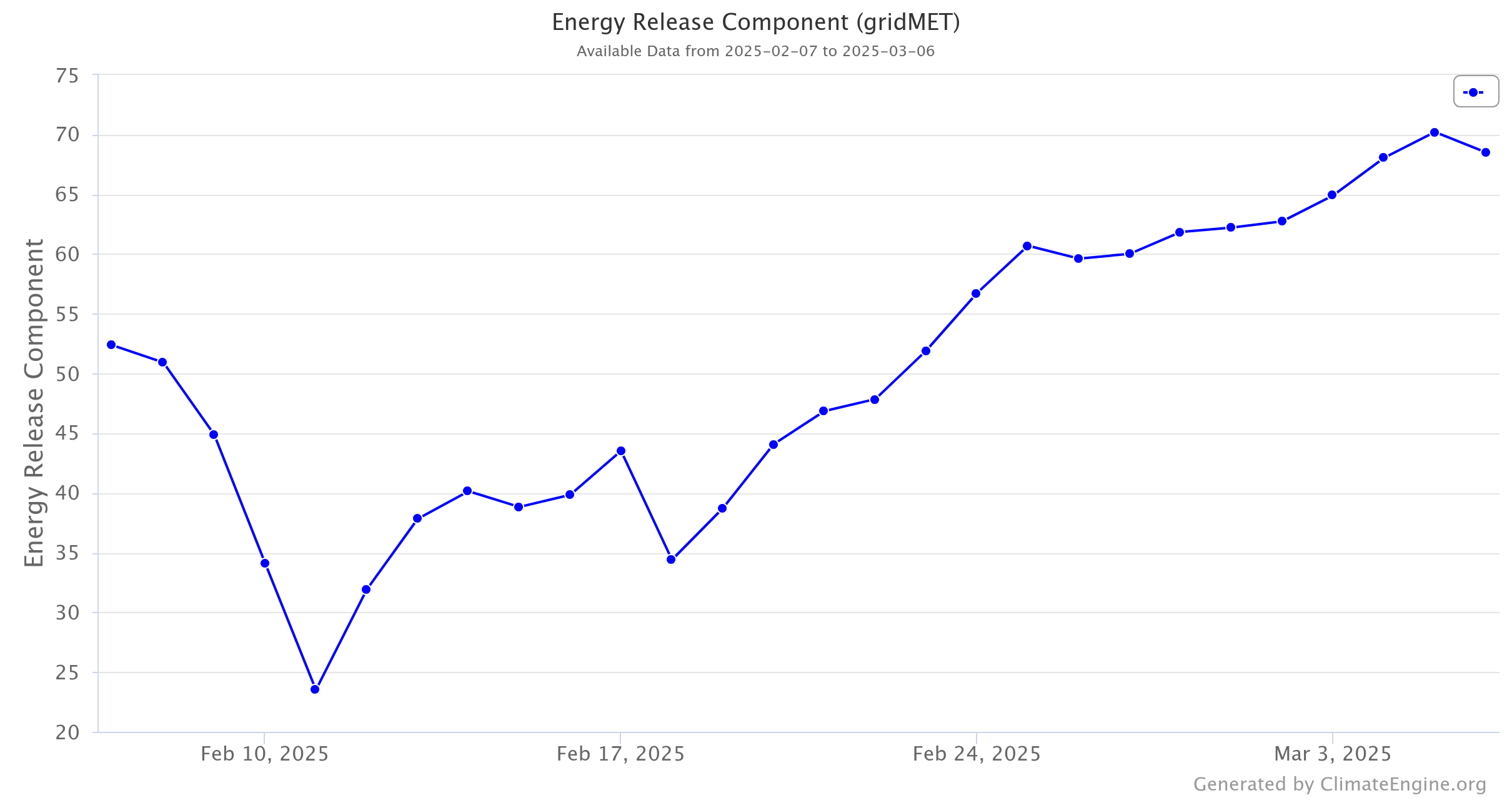
Example #2: Plotting Historical Fire Indicators
To plot the last 28 days of Energy Release Component (ERC) for this hub-8, we will leave the first two sections the same. We will then head to the Variable 1 section, where we will update Type to Climate & Hydrology , Dataset to GridMET - 4km - Daily , and Variable to Energy Release Component (ERC). We will leave the next two drop-downs the alone, and head to the Time Period section. We will select Custom Date Range and update Start Date to 2025-02-07 and End Date to 2025-03-06. Then we will click the Get Time Series button.